
Over the past three days I was playing with oil paints trying to add more depth and variety to the whippet. This vehicle is actually quite suited for such experimenting with a lot of flat surfaces that offer great canvas for weathering effects. One of many mistakes I make when weathering models is that I lack courage to add more contrast to make the model visually rich. This is often caused by the fear that having spent many hours building and painting the model I could ruin it in one step resulting in ridiculous look…
This time I took the bold approach and used oil paints to used colour variation all around trying to depict vehicle that have seen extensive use and action.
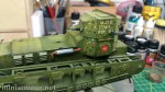
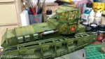
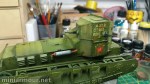
The three photos below show 3 steps in which I have done this phase:
- Added small dots of oil paints on the surface that was previously moistened with enamel thinner to avoid marks which small blobs of paint can leave on the surface.
- Blending the paint with the surrounding to reduce the contrast, I did this using small round brush with very little if any thinner.
- Spreading the blended paint using completely dry flat brush using combination of upward and downward motions. Again, it is important that the brush is dry, otherwise you will remove the paint and reduce the intensity of the desired effect.
The paints that I have used are from my trusted set:
- Burnt Umber – my most universal colour. Don’t blend it too much, otherwise it will lose intensity and once dry will not be observable at all
- Naples Yellow – Like this colour (as you might have noticed if you read this blog or other articles that I have published). When you blend it, the intensity of its effect won’t be strong, but once dry will stand out especially against darker background – such as Russian green. So unless that is desired (e.g. dust effect) blend it bit more.
- Cadmium Orange – Have not really tried this before. Quite strong and intensive colour, that will not blend easily and will stand out when wet, but after drying the intensity will be lesser. It is nice to simulate muddy tone, just a bit more brighter to make it visually richer.
- Indian Red – Rusty like colour, bit too on the cold side, so go careful with it. Also tends to dry faster and leave marks on the surface where the blob is placed, so better blend it fast.
I usually use hairdryer to speed up drying process, which enables me to correct any imperfections or effects I don’t like.
At this time the resulting look is quite good, though it needs addition of other effects to make it into realistic and consistent effect, I will post better shots of the look in the next days, pictures below were just quickly taken with my phone.
See previous part / See next part

1 reply »